
Don't Make Your Artist Cry
I know a lot of talented people and in 2020 I joined a Discord writing group full of strangers. It’s been a few years and I’ve grown in my writing craft through our encouraging conversations, challenges to up my craft game, and the general bemoaning of bad storytelling, bad writing, and bad art.
Let’s talk about writing visually and how to emotionally support your artist so they aren’t gnashing their teeth, pulling their hair out, and lamenting hours spent on a bland, boring commission.*
Portrait vs Illustration
When it comes to novels, all scenes looks the same to the author as they write. I’m not saying they ARE the same. The author is high on the thrill of writing and wants to see something exactly as they envision it.
KM Carroll (author and artist): PSA to all the nonvisual authors out there: Sometimes exactly what is written on the page does not make a good illustration. If you want readers to enjoy the illustrations in your books, they can't be ugly. Or worse, extremely static
But when it comes to having a piece of art commissioned for your novel, portraits and illustrations are not the same thing. So what’s the difference?
In photographic terms, a portrait is supposed to focus on, and bring out, the central subject. It draws the viewer into the sitter’s world and invites them to experience the moment the snapshot was taking. A portrait is a moment.
An illustration tells a story. It’s a complete scene showing movement, emotion, something important happening. Instead of enjoying a moment with a person (like a portrait), an illustration is the starting gun of a race. It’s thrill and suspense - we want to see what is happening next.
Tips for Making Visually Interesting Art
KM Carroll: Hollywood is really bad for perpetuating mud [colored clothing and settings], yes...When people describe a desert, for instance, it's gray sand, gray mountains, gray scrub brush. When in real life, the desert is violently red and green and blue and purple.
I follow some ancient history pages on Facebook and almost daily I see articles about how archaeologists are discovering intact Greek and Roman mosaics of intricate designs, microscopic paint traces on statues, preserved clothing from thousands of years ago, lifelike portraits in tombs of commoners, and more. The world is brimming with color and patterns, both natural and man-made.
Make your scenes colorful
Diagonal action lines and triangles add visual interest and make a scene less static
Make sure something is happening in the scene.
Jessica C Joiner (author): If I'm paying for art, I want an action scene, a movie poster shot, character refs, or one of those fun imaginary group selfie paintings.
KM Carroll: That's true! Action scenes are so much easier to make visually interesting. I always go for anime as action shot reference, because the movement in the art is amazing. You don't get it in real life movies so much unless it's a kung fu movie. Real life has this annoying thing called physics, whereas with art you can push the poses more and really stylize it.
How To Talk To Artists
I’ve always wanted character art done for my Fourth Prince series since I’m combining aspects of so many eras together. Besides the fact that I can’t afford all the art I want done, I struggle to visualize my characters and setting. After narrowing in on some specifics of the eras in questions, it was as if the past opened up and I could barely keep up with the images and colors I wanted to include. Now I’m throwing colors and details around my novels like confetti. I asked how to convey what I’m seeing in my mind.
KM Carroll: If you can provide any references at all, it helps so much. "I like this set of clothing, and I made this face on Artbreeder, and I want them sitting and holding a sword like this movie screenshot". A good artist can take those references and go a long, long way. Just tell me what stuff looks like, show me a scene you wrote, show me photos of actors whose faces/hair you like, it doesn't have to be hard.
Know your own characters and settings
Find references images and know what you like about each one
Know that what you WRITE might not be visually interesting to SEE, and swallow your pride. The image in your head is a snapshot - try skipping ahead or behind a few frames to pick the right one
If you trust your artist, TRUST your artist. They know what would look epic. Let them have some fun. Yes, they’re getting paid but that doesn’t mean teeth-gnashing, hair-pulling, and lamenting should be involved.
If you’re not sure you know what you want, give them all the details you have and see what they come up with.
If you don’t like something, be polite but blunt and informative. They’d rather redo a ten minute sketch than a fully inked, colored and shaded image. Many won’t allow changes outside of coloring and shading after the sketch has been approved and inked.
If they ask for more information on the characters, scenes, plot, motives, themes, etc, it’s because they want to add depth, emotion (and maybe an easter egg) into the art. They’re not going to steal your plot and characters, write a novel around them, and become best-selling millionaires.
Colors and shading are completely different and dependent on the location and amount of light. If your scene is at night, please for the love of sanity, tell them BEFORE they finish it.
If you can draw stick figures and blobs with arrows, sketch up a rough draft for the artist to see what you were thinking. Giving them an idea of where things are in relation to each other is very helpful.
How It Looks
I asked KM Carroll for a character portrait for my Fourth Prince series. I gave her the freedom to draw whatever she wanted since I couldn’t picture the face and clothing reference together. This is the information I gave her:
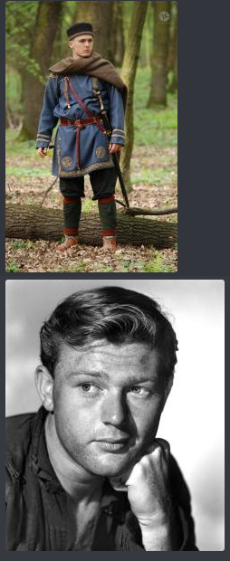
Prince Regent Roald of Laylamore
Male, age 23, 5'11, lanky
Blond hair, clean cut, shorter hair trimmed and not longer than the ears
Round boyish face.
Clothing style ancient Slavic (Viking-ish), with tunic, trousers, boots, cloak.
Weapon is a Roman galdius with hilt on left hip.
The B&W is the facial/physical reference (the late actor Martin Milner as a young man), and the color photo is the clothing reference I found online.
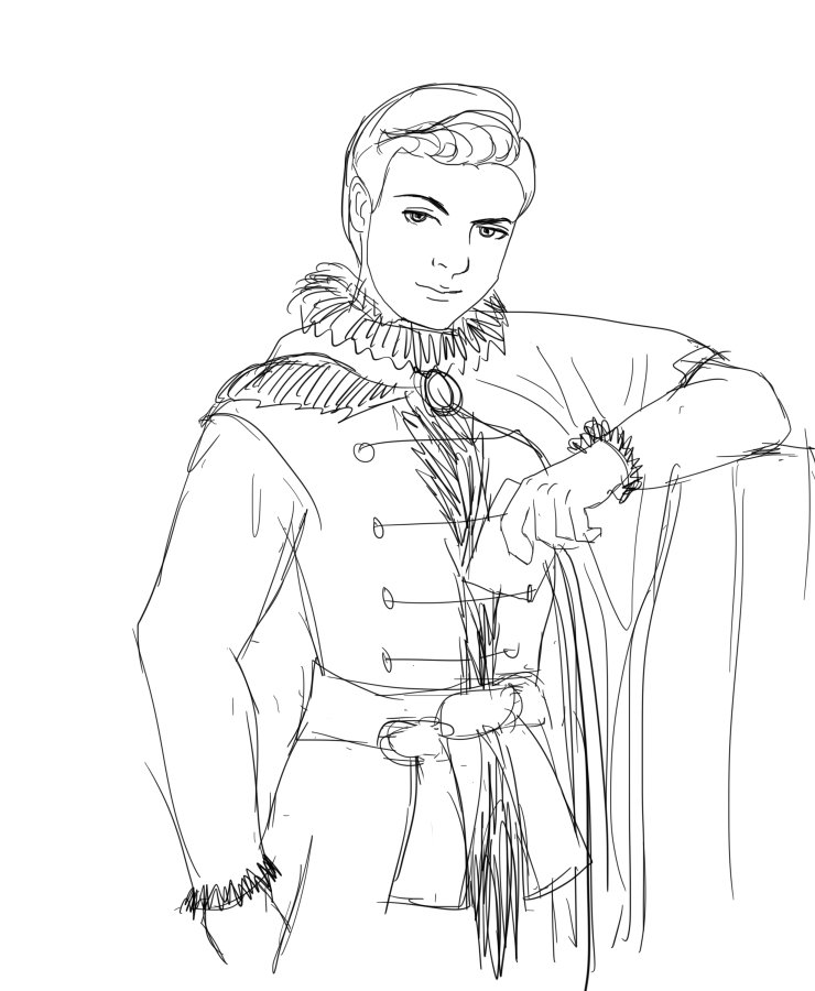
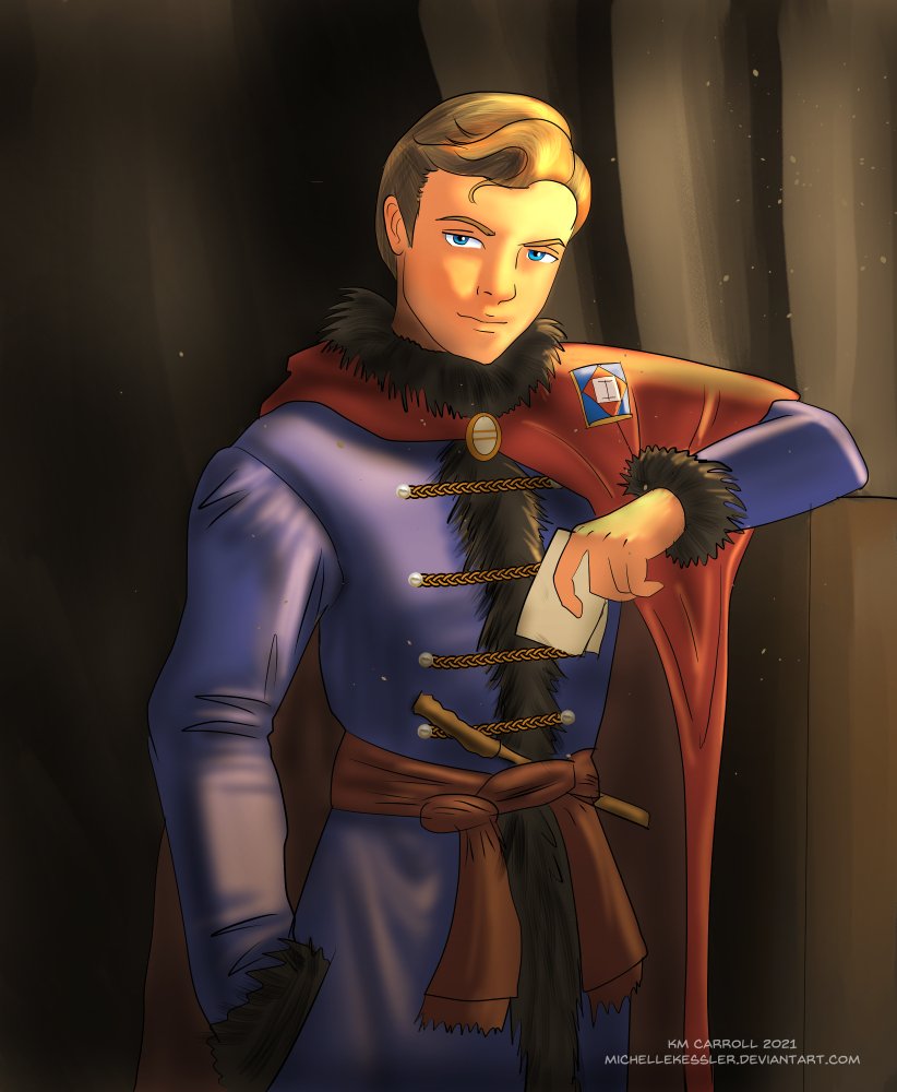
After I approved the sketch, I was asked about embellishing the clothing or giving him something to hold. Since Roald has been managing the kingdom in his father’s absence, I said he could hold one of the daily military reports in his hand; the emblem on the left shoulder of his cloak is the army insignia for the unit he commands; and the pin at his collar is the central image from the Laylamorian flag. These are all details that would never have made it into the portrait if I hadn’t been forthcoming with the character and his world.
Seeing these three images side by side helps me understand the process.
Another example is the cover KM Carroll made for my upcoming novel Of Ice and Roses.
My mock-up (left) and KM Carroll’s cover (right)
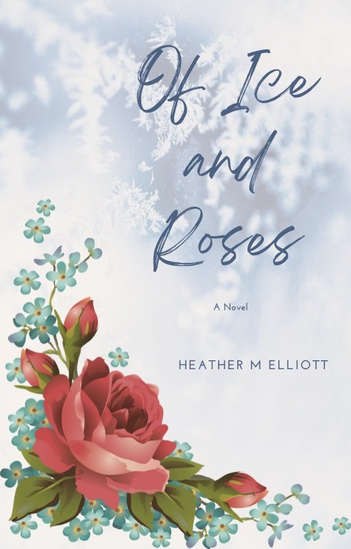
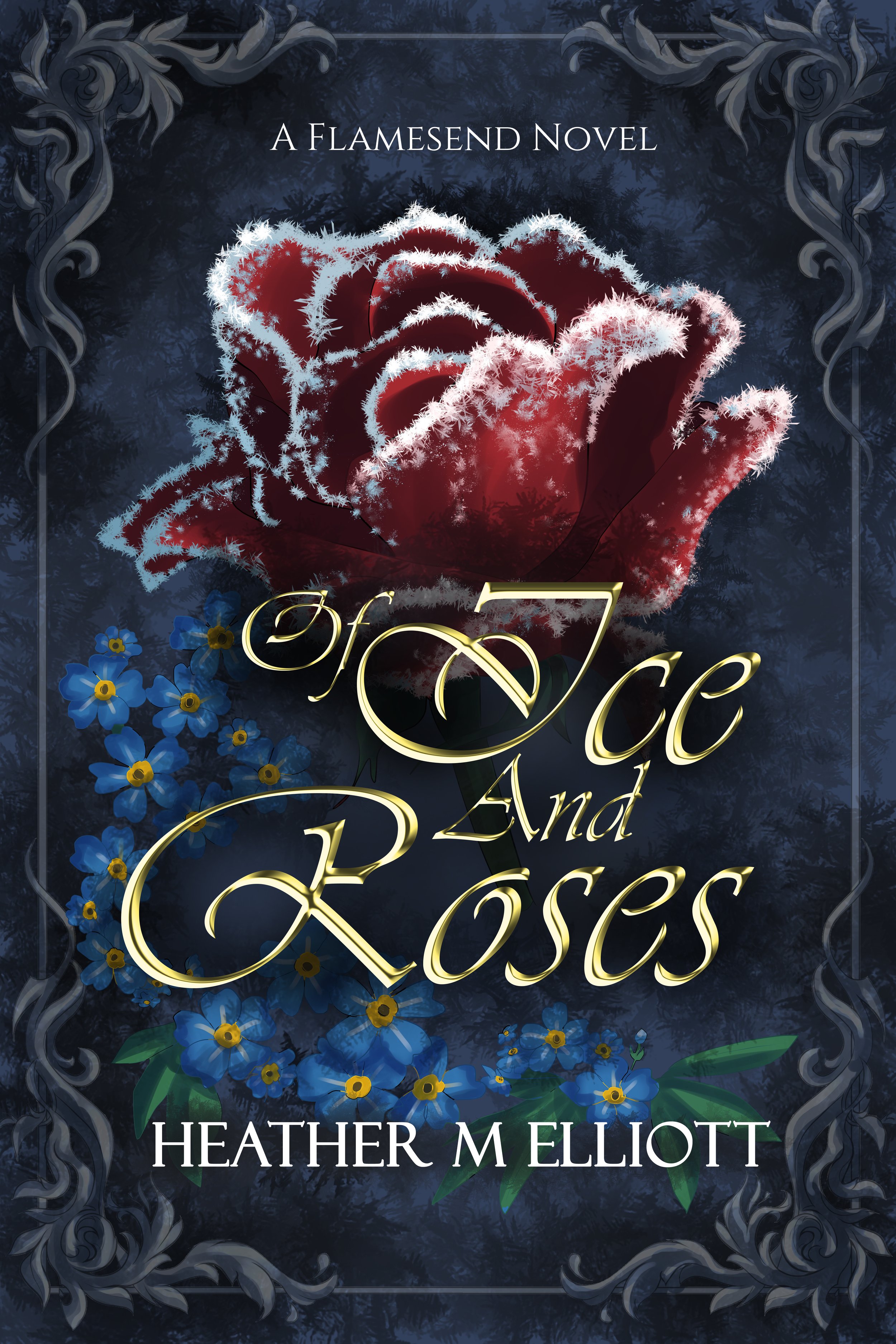
At first glance, they might not look similar but all the elements are there - roses, blue flowers, corner embellishment, fancy font, author name in all capitals, and the blue textured background.
Hearing of the frustration of my artist friends have as they struggle through boring commissions has helped me improve my own writing. I now look at the scene I’m piecing together and ask “What can I do to make this more visually appealing?”
*This message was approved by several lamenting artists